I love Futura. I have my header written in Futura Light, for a whole year now, and still I don’t feel the need to change it. It’s clean and crisp, and universally appealing.
There’s so many interesting facts about Futura. For example, Futura had the honour of being the first typeface on the moon, chosen for a commemorative plaque left by the astronauts of Apollo 11 in 1969. It was Stanley Kubrick’s favourite font. He used it in 2001: A Space Odyssey and Eyes Wide Shut. Wes Anderson has done the same with his films (The Royal Tenenbaums, The Life Aquatic, etc), using Futura (specifically Futura Bold) almost exclusively in the artwork, credits, and even within the films.
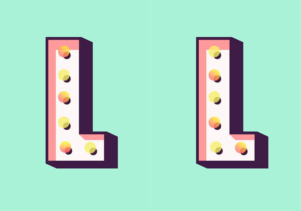
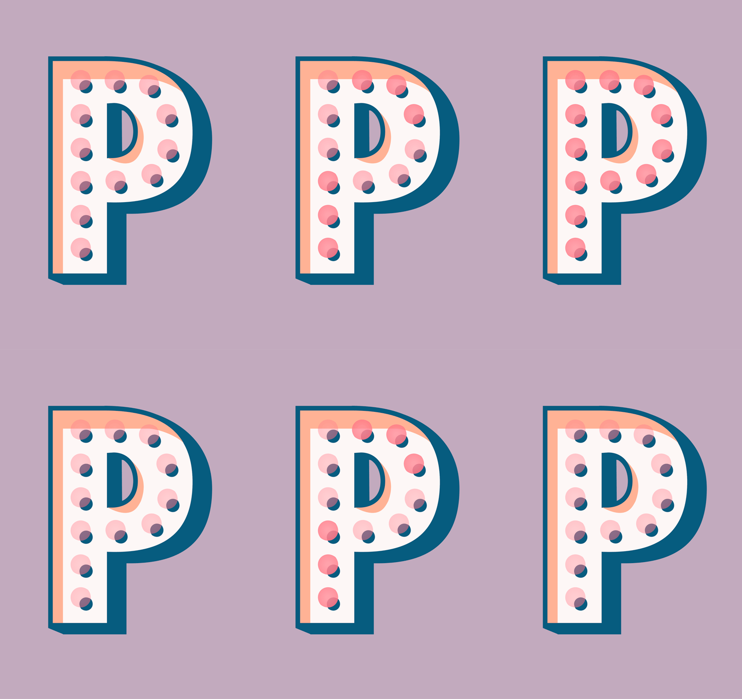
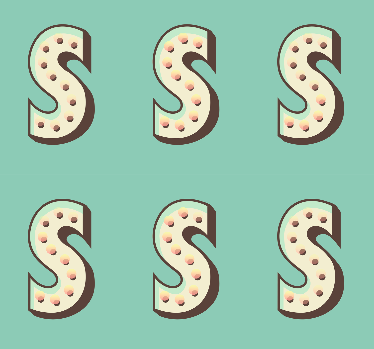
So when I stumbled upon Futura Carnival gifs, it was pretty much obvious what I needed to do – a.i. post them all and watch them blink till my eyes are sore. :)
Futura Carnival Cut is a personal project by Nicolai Boye Brodersen.
Futura went to the carnival got inspired and changed its whole wardrobe. Now Futura is vibrant, colourful, three-dimensional and happy. This is a personal project made to test out different patterns, textures, and colour combinations.
. . .













No comments:
Post a Comment