. . .
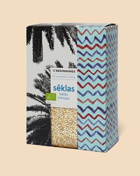
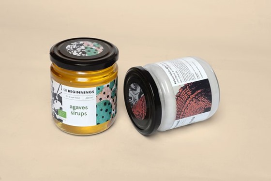
I love this super fine packaging for Latvian raw food company called The Beginnings, designed by Asketic Studio. I love the simplicity, hand drawn patterns (that are inspired by the origins of the ingredients) and a nice & neutral sans-serif.
“The Beginnings offers strengthening raw food ingredients from around the world. Garlic from jungles of the North, wheatgrass from meadows of the East, the most fragrant cocoa of the South, the hottest tropical ginger root, algae from the purest seas. The wild, uncontaminated power of life. Those are your Beginnings – the source of the authentic you.”
“The visual identity has been created using patterns from unique places around the world. By combining and contrasting these patterns, we’ve brought the wild of the jungle into the wild of the city. During the process we created design concept and identity, product packaging, a library of illustrated patterns and visual guidelines to help expand the brand identity as it evolves.”
. . .


This comment has been removed by the author.
ReplyDeletejep, danas sam ti došla u goste...pa znaš, tmurna nedelja, u slastičarnici sam tek navečer....<3
ReplyDeleteou, ja sam na dijeti, po ceo dan sam gladna i ne pamtim kad sam jela kolace poslednji put... tipa, dva meseca, ako ne i vise. jaaako ti zavidim, jako.
ReplyDelete